
30 March, 2010
Inspiration - Logorama
My friend James Bradley recently showed me this video, where a city and its inhabitants are visualised by exisiting logos. A very creative and intuitive creation, a must see! Click Here to see the video!

26 March, 2010
Project 3a - Genius Names
Our first teamwork project. We were told to pair up, and design four logos, and think of a fitting name from a list of themes. The logos had to be recognisable and relevant to the company name. I worked with Lucy Kelly and I really enjoyed it, teamwork is much more interesting than solo work.


.JPG)
.JPG)
.JPG)
.JPG)

Exotic Feel; A solar powered sex toy.

Bubloon; The world's strongest chewing gum.
Rainbow Roulette; A coloured sweet that stains your teeth.

Dead Set; The world's strongest glue.
.JPG)
.JPG)
.JPG)
.JPG)
24 March, 2010
Life Drawing - Week 2
I'm really starting to enjoy these life drawing sessions, I much prefer using charcoal than pencil, as it leaves a much nicer and more moody mark. It gives my drawings more emotion, as the fact that I'm not very accurate is almost hidden by the expressive marks. However, I need more practice with charcoal.


17 March, 2010
Life Drawing - Week 1
Life drawing went ok, but I'm rubbish at it, and I hate using pencils, the marks I make with them are awful.


Suger Emporium
We had to create a 20 second countdown from 10 to 0, with an overall theme. Medium was to be either film or animation. I'd done many animations beforehand and wanted to try out using the AV suites with a new medium.
16 March, 2010
CCA - Photoshop
The following images are the best pieces of work I produced while being taught how to use photoshop effectively.
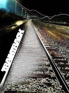


We were told to simply use one photograph, and use the history brush tool along with filters to create a dynamic image. Although anyone who knows photoshop can see and name all of the filters I have used in this image, I havent just slapped them on, unlike most people, so in my opinion, I believe I have actually worked with the filters rather than using them to make it "look cool".

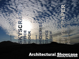
We had to be as creative as we could by simply using one or more photographs and using the type mask tool. I chose the sky as the background, and decided to use the type mask layer to symbolise a city skyline. When the tutor saw what I had produced, he advised me to make it look more like an advert/flyer. With the added typography at the bottom, it re-enforces the message shown above as well as giving the reader more information.

This was created using existing photography, and merged together using layer styles, opacity and filters. However, using these simple and often overused techniques, the final image is quite aesthetic.
12 March, 2010
Project 2b - Degrees of Sticky
Our second infographics brief. We were each given a different topic/theme, and we had to be as creative and witty as we possibly could to create an engaging and interesting final piece. Not only were we told to draw the infographics, but we also had to add ingenious sentences to accompany them, and add another message alongside the pictures. We were also told to make the final as a whole relative to the subject, rather than just place the work onto a plain white background.
.JPG)
.JPG)
.JPG)

My subject was Woodwork Projects.
I designed the overall aesthetic to look like a black and decker manual that you would receive when purchasing a product of theirs.
.JPG)
.JPG)
.JPG)
Subscribe to:
Posts (Atom)