

27 March, 2011
Typeface pt.4
Finally designed both upper and lower case letters now, and I'm happy with the results. however I may change the upper case G as it feels out of place and I'm not too keen on it. What do you guys think? Alos, I'll probably call it Nicholson Sans unless I (or anyone else) comes up with a more suitable name, I just feel that naming it after myself is a little arrogant?
26 March, 2011
Secure Solutions Presentation Boards (pt3)
For the third part of designing the company brand we were asked to create two A2 boards presenting a signage system for their home office. I decided to present the boards with an infographic aesthetic to compliment the businesses ethos and professional look. After much stress over illustrator crashing on me and not rendering the infographics (see bottom two images as to why) And I'm impressed that I even managed to fit an I.T. Crowd reference into my work.


These next two images are what my screen looked like when I was designing onscreen. I filled the canavas with my designs, and the white box in the center of the image is the size of an A3 piece of paper...
I think the word overkill is suitable.


25 March, 2011
Help Japan Poster
After seeing Lucy Kelly's and Dylan Sewell's versions of the appeal to help Japan posters, and along with all of the other posters (my favorite designed by W&K) they inspired me to create my own. I wanted to convey support whilst also keeping the iconic use of the Japanese Flag.


24 March, 2011
Concrete Watermark
My friend Hugh Leoidsson has been comissioned to re-design club concrete's website and also put forward the idea for a watermark for the photos that he and other take for them. I helped hugh with the ideas, and we found that the typeface that I have been coincidentally working on works perfectly for what was needed! And I'm sure those of you who attended concrete's 7th birthday have already seen this on your photos.
I edited the typeface slightly and realised that I like this style a lot better than what it was before, so I'm remodelling the rest of the letters to fit these.


Two of my coursemates, James Howie; with his amazing new haircut, and Dylan Sewell; absolutely stoked to see James' new haircut!
18 March, 2011
Birthday Card - Claire
My friend Claire absolutely loves felt and all things crafty and is an absolute goddess at creating amazing felt cubes (one of which she made for me for christmas, which is epiiiiic!), so for her birthday I decided to get her loads of felt, wool, some ribbon and thread! I also attempted to make a little bear, which when you compare to the felt cubes Claire makes, my stitch work is appalling, but I gave it a good shot I think :) I've also wanted to create some hand rendered and floral-esque type for a while now too, which I've managed to do so and killed two birds with one stone!


17 March, 2011
Brickyard Poster - Kid British
My poster for Kid British @ The Brickyard. And a really bad photo from my phone of one printed out on the uni walls!


16 March, 2011
Secure Solutions Stationary (pt2)
For the second part of the logo brief, we were asked to choose one company to take forward to design stationary (i.e. Business Card, Envelope, Compliments Slip and a Letterhead). I decided to take forward Secure Solutions and create a very trustworthy and professional looking company through their brand. I am very pleased with the outcome, especially with the use of the asterisks. However, the business card was stressful to put it politely to get working!


06 March, 2011
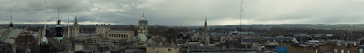
Panorama - Oxford (Carfax Tower)
Last weekend I journeyed down to Oxford to surprise my brother, and decided to take my camera to take a few photos of the sights, and here are two panoramas of the view from Carfax Tower. Unfortunately, the weather was rainy/grey, and as soon as we left the tower it brightened up, just our luck!


05 March, 2011
Experimental Typography pt.3
I decided to create a bold style typeface which could be either; a bold version of the previous experimental typeface OR it could be a completely new face. What do you think?

I've found a few alterations so far, such as flipping the b's ascender and flipping the q's decender so that they match with all of the other ascenders and decenders. The k needs to be changed, maybe removing the curves and replacing with proper legs, I forgot to add the dot on the j, and the s needs improvement too, but are there any other alterations that you can see?

04 March, 2011
Logo Designs - Identity
We had t0 pick 4 companies of a list and create a logo for each. We then had to designate 'themes' for each, such as type or image based, metaphor, geometric etc.


Secure Solutions
A national company offering hi-tech data security advice
and services to financial institutions, local authorities.

UK Space Agency
Public funded organisation that promotes UK scientific
and commercial interests in space exploration and commerce.

Fellside Farm Shop
A single outlet farm shop selling home produce meat and
vegetables.

The Riverside Trust
A charity the promotes habitat creation and management
for wildlife on rivers in England and Wales.
Subscribe to:
Posts (Atom)